jelder6 days ago
What it actually looks like: https://fonts.google.com/specimen/B612
ShakataGaNai6 days ago
Thank you, that's the one thing I'd expect to be a screenshot in a github repo. Regardless, I don't find it particularly legible. The taller aspect ratio with narrow letter gap actually is not super readable to me?
Maybe It's "more readable" for plane screen fonts than the other alternatives. It's not fair looking at a font on a 49" highdef ultrawide and saying "This isn't as good".
kergonath6 days ago
> Thank you, that's the one thing I'd expect to be a screenshot in a github repo.
Indeed. That’s clearly missing from the readme.
> Maybe It's "more readable" for plane screen fonts than the other alternatives. It's not fair looking at a font on a 49" highdef ultrawide and saying "This isn't as good".
Yeah. Their benchmark was suboptimal conditions in an aircraft cockpit. I would assume that they tested drastically different lighting conditions and exotic factors (for a font designed for computers) such as motion, vibration, and crew exhaustion.
cratermoon6 days ago
It's very readable at small sizes. Try 8 point.
Edit: even better, grab a METAR from your favorite airport and drop it in at 8 point
Doxin6 days ago
That's surprisingly readable for such a tiny size!
riedel5 days ago
I wonder if the main effect is that it is readable for people with begining presbyopia (like me). It seems that this is a problem particularly for pilots and it can be compensated heavily by optimizing visual processing [0]. I at least have the feeling that the small font could be perfect for packaging as it seems to be better readable with my age related farsightedness and could relieve my struggles shopping.
[0] https://www.sciencedirect.com/science/article/pii/S004269891...
eternityforest4 days ago
Atkinson Hyperlegible is very specifically designed for visual accessibility, and it's what I use in my automation app, both for accessibility and on the assumption that it's probably also a good general purpose high reliability font.
But another comment pointed out that B612 might be specifically tested in conditions with vibration and fatigue and other factors like that. I wonder how Atkinson compares?
cratermoon4 days ago
Well I have slightly more advanced than beginning presbyopia and wear reading glasses almost all the time now. My experience with most fonts is why I noted B612's legibility at small sizes.
saltcured5 days ago
It's funny, I see it and immediately feel it has too much spacing on that specimen page. On my laptop screen at its default presentation, it approaches where my brain starts to fixate on dissociated letters instead of words.
I've also experimented with custom fonts on my (Garmin) watch and found that taller and narrowly spaced characters seem to increase legibility for me. This is for mostly decimal data, and I want to read with very brief glances, in challenging viewing conditions, rather than linger to appreciate the graphemes.
bingo-bongo6 days ago
Maybe the taller aspect ratio is due to cockpit surfaces being more horizontal or vertical than eyesight..?
Like letters/words painted on the road for drivers to read them.
oniony6 days ago
There is actually a sample in the repo: https://github.com/polarsys/b612/blob/master/docs/sample.png.
asciimo6 days ago
There is a PDF and a PNG in the docs/ folder (https://github.com/polarsys/b612/tree/master/docs), too.
petercooper6 days ago
And the mono variant: https://fonts.google.com/specimen/B612+Mono
polishdude206 days ago
Funny how it's supposed to be designed to be legible. I read that as "disengage" at first rather than "disregard"
Night_Thastus6 days ago
It may account for the specific displays used in the cockpit, the colors of the font and background, and maybe even interior lighting.
IOW it may be more optimal in its real usage.
octo8886 days ago
Not just me. Maybe it's how it's displayed on the web. I had an immediate "this is awful" response LOL
fmajid6 days ago
The kerning is not great, for starters
atoav6 days ago
Legible != Readable
Legability means you have to be able to differenciate words and letters. With a font specialized for aerospace use that probably also mean it has to retain that quality when printed on panels.
A special requirement I would think of is legability while in motion. Try taking your favourite, perfectly kerned font and reading it while shaking your head wildly in poor light conditions, then you get a hint of why this font isn't optimized for looks.
dude2507116 days ago
Google using anti-Google text specimens is wild: "...No one shall be subjected to arbitrary interference with his privacy,...". Then again, it could have been edited by Gemini.
rafram6 days ago
sho_hn6 days ago
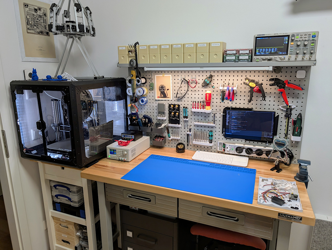
This seems as good a thread as any to post this in:
If you're fond of aviation aesthetics, I was recently looking for a workshop cart to occupy a 60x40 cm space and couldn't find any, until I realized that (a) standard issue half-size ATLAS airplane galley trolleys are 30x40 cm and (b) they can be bought by regular people and are very price-competitive with professional grade workshop and office furniture.
Now I own these and they're amazing:
https://mero.ng/i/xnZNqouw.jpg
I especially like the little pull-out tables at the top (they're right next to https://eikehein.com/assets/images/makercorner.jpg).
It's also nice to have a constant reminder to stow them in case I take off or land my office.
ghostly_s6 days ago
To save anyone else the searching: parent's definition of "price-competitive with professional furniture" seems to be $500-$1000 used. I can't find anyone listing a price for new.
sho_hn6 days ago
Yup, mine were 650 EUR a piece new with the drawers shown in the other comment from https://trolley-dolly.de/ (one of several shops I found), though it looks like they now stopped with trolley+drawers bundles.
I was looking at the used market at first, but it turns out that a lot of those are enthusiast collectibles and don't seem to be cheaper than new ones when in good condition, i.e. airline branding bumps the price up, sometimes considerably.
It's obviously all >IKEA, but if you compare this to stuff like Lista office drawers or automotive workshop trolleys it's maybe half, and much closer to the pricing of lower-end stuff from a big brand chain toolstore--but with higher build quality, superior rigidity, better wheels and brakes, and being lighter to move around since the application is weight-conscious. Add the subjective neat-ness factor and I think it's worthy of consideration :)
cromka6 days ago
Seems like a life-hack to me, great job!
quokka6 days ago
I found some on sale for around $300 on Etsy. Shipping is very expensive, so they would probably make sense only if you can manage local pickup.
_charlier6 days ago
Adam Savage mentioned in a Q&A that, many years ago, he stumbled upon dozens of these in an empty parking lot behind an industrial building in SF. Apparently he still uses a couple of them in his workshop.
moffkalast6 days ago
I hope you stow it in its compartment while your house experiences turbulence like the label demands.
dotancohen6 days ago
That's how the wife knows he's being serious during an argument. He goes and stows his trolleys.
bpye5 days ago
At least they're prepared for an earthquake.
delta_p_delta_x6 days ago
Can I just say, that's a beautiful setup?
sho_hn6 days ago
Thank you!
kqr6 days ago
What are their innards like? This looks very useful!
sho_hn6 days ago
Since the inside dimensions and mounting rails are standard, there's lots of different compatible inserts you can get.
I cheapened out a bit at that point and went with double-height plastic drawers:
https://mero.ng/i/RixswvHW.jpg
Drawers generally come in single/double and plastic or aviation-grade welded alu.
There's also a bunch of funky stuff like cages to keep hot bread in for serving, and an after-market of "galley trolleys as designer furniture" companies that turn them into minibars with wine chillers and bottle storage and what not.
biohazard26 days ago
Two articles providing more information about the creation of this font: https://lii.enac.fr/projects/definition-and-validation-of-an... https://www.enac.fr/fr/une-police-realisee-par-les-chercheur...
In particular, a screen of an Airbus screen and a video showing parts of the creation are provided.
kens6 days ago
Curiously, the photo of the screen shows slashed zeros, while the font sample shows non-slashed zeros.
AlfredDogsbody6 days ago
I noticed the same thing. It's the first thing I check when someone describes a font as "legible." I want to see O0olI|i diplayed.
saltcured5 days ago
The photo actually shows some slashed and some non-slashed zeros too. Look at the PSI numbers on the left versus the time numbers in the center right.
That doesn't seem great from a UX standpoint.
bitschubser_4 days ago
codepoint E007 is a slashed zero... would be interesting to know why this is not the default
bitschubser_4 days ago
strangely its not included in the regular font face... only in the italic, bold, bold italic and monospace variant
0123456789
FabHK6 days ago
Designed for ease and efficiency of reading and to make letters unambiguous by "maximising the distances between forms to allow for easy, clear identification of each character" [0, p. 7]. Compare FE-Schrift [1], which is designed for number plates to make letters unambiguous in the sense of hard to convert one into another by masking or adding parts:
[0] https://github.com/polarsys/b612/blob/master/docs/B612-Leafl...
uyzstvqs6 days ago
There's also B612 Mono, for use in your text editor or terminal.
sho_hn6 days ago
Oh, interesting. The proportional font looked pretty terrible to me, but I threw the mono at some C++ and it's actually not unpleasant. Maybe worth a longer trial.
6SixTy6 days ago
One thing I've noticed with this font though is that the square and round brackets look very close to each other.
One of the Monaspace family fonts is very aesthetically similar to B612, but the round bracket is very exaggerated compared to the square bracket.
croisillon6 days ago
Just in case anyone is wondering about the name: B612 is Saint-Exupery's "Little Prince"'s planet (asteroid). A real-life asteroid has then been named B612, but its number is actually 46610.
bitwize6 days ago
46610 decimal = 0xb612 :)
crabl6 days ago
It's interesting to me that those fonts seem to include ink traps: curious if this has anything to do with the display tech that's used in the cockpit
nonethewiser6 days ago
I had not heard of ink traps. Basically, they are characters that try to account for ink bleeding. By putting more negative space in corners, for example. https://en.wikipedia.org/wiki/Ink_trap
But that gives me the impression it would have nothing to do with displays. And makes it a pretty curious choice.
Although I personally dont see any ink traps from the font linked in the comments https://fonts.google.com/specimen/B612
whalesalad6 days ago
Set font size slider to 300px and you will notice them. I'd love to see the study that decided this was the right move. For a digital display its just noise and won't even render correctly at small sizes without a high dpi display. I doubt they would do this just for stylistic purposes. Seems like a very odd decision to me.
sho_hn6 days ago
It seems far too deliberate not to be so. Wonder about the reason too. Maybe dual-use with printouts?
Edit: I found their reasoning:
"Moreover, activity analysis has highlighted possible impairment in reading context: variations of light and viewing angle, high cognitive load for the pilot etc�
So, B612 has created a concept of increased legibility of shape for less ideal situations and associated methods of mark corrections, to optimise the final rendering of the text and on-screen reading, particularly with the use of incises and ‘light-traps’ .
An incise is a small serif which interrupts the regularity of the vertical line: here it allows to accentuate the clarity of the leading stroke (top part) of the vertical stem 8 to avoid it being rounded off when antialiasing.
The principle of ‘ink traps’ has existed as long as typography has: it is a small indentation at the junction of letter strokes which ‘traps’ the ink on small characters, so that it doesn't block the junction and affect the legibility. In the case of B612, the ‘light traps’ accentuate the counterforms 7, particularly for the sharp angles� The indenta- tions are always well distinguished, even at a small size, and the contrast between the different strokes of the character is reinforced."
From page 8 of: https://github.com/polarsys/b612/blob/master/docs/B612-Leafl...
The doc also has a photo of their experimental test environment (unsurprisingly: a cockpit) and info on the test process.
mbreese6 days ago
I didn’t know about ink traps, but I did notice them right away in the sample images. I was guessing that it would help increase legibility when it was embossed or in raised printing on a physical button.
Nextgrid5 days ago
I wonder if it’s a mitigation for common visual conditions or for better viewing in high-vibration environments?
crazygringo6 days ago
If the font is used primarily as light on black, then light bleeds analogously to how ink does, albeit via a different mechanism. Whether on the screen itself (like CRT) or on our retina.
wrs6 days ago
Ooh, great question. I guess “ink” traps would actually make sense for CRT displays due to phosphor bleed. (See the design of the VT100 font.) However, according to Wikipedia Airbus started using LCDs well before this font was made.
Nextgrid5 days ago
Firmware updates could account for this font being used on much earlier hardware though?
The monitors (or DUs for “display unit”) could remain old but the underlying computers could’ve been upgraded.
eternityforest4 days ago
Maybe it's beneficial from a human factors perspective to have one font for printouts and screens?
diggan5 days ago
Seems like Page 8 in the PDF/leaflet from the repository talks about it:
> The principle of ‘ink traps’ has existed as long as typography has: it is a small indentation at the junction of letter strokes which ‘traps’ the ink on small characters, so that it doesn't block the junction and affect the legibility. In the case of B612, the ‘light traps’ accentuate the counterforms 7, particularly for the sharp angles� The indentations are always well distinguished, even at a small size, and the contrast between the different strokes of the character is reinforced.
> An incise is a small serif which interrupts the regularity of the vertical line: here it allows to accentuate the clarity of the leading stroke (top part) of the vertical stem 8 to avoid it being rounded off when antialiasing.
athenot6 days ago
That stood out to me as well. Bell Centennial† used that for phonebooks; here I suspect the light-on-dark display has some visual bleeding that this compensates for, especially for tired pilots.
killermonkeys6 days ago
The leaflet (https://github.com/polarsys/b612/blob/master/docs/B612-Leafl...) explains the design thinking behind this. They call them "light traps", though I'm not totally convinced they work well when antialiasing is used.
gdupont6 days ago
Stuff that are on display can also be printed (on board in the cockpit) for whatever reasons the pilots decide.
I thought that the printed were using thermal printing (for which I'm not sure the ink traps apply) but maybe not all of them.
[deleted]6 days agocollapsed
java-man6 days ago
kens6 days ago
Interestingly, a lot of those characters are not Unicode characters: the aircraft motion, weather pictograms, mail, wifi, phone, the "computer science pictograms" such as start/stop/copy/paste/print/trash, and so forth. Specifically, these use Unicode's private use area at E000.
(See B612-Leaflet.pdf page 35.)
ApolloFortyNine6 days ago
In my opinion, the newer Atkinson Hyperlegible (Next) looks easier to read long term. Maybe B612 is 'better' when you have to read just a few words on a screen, but I've switched to Hyperlegible recently for ebooks and have enjoyed it.
[1] https://fonts.google.com/specimen/Atkinson+Hyperlegible+Next
egberts13 days ago
Biggest problem with AirBus font is 1|ilL7 oO0@ ,.
The best font for programming is Source Code Pro.
https://fonts.google.com/specimen/Source+Code+Pro?preview.te...,.
Second best is IBM Flex Sans
https://fonts.google.com/specimen/IBM+Plex+Sans?preview.text...,.
java-man6 days ago
I don't understand why 0 and O look nearly identical.
biohazard26 days ago
It seems they are using the regular zero or a slashed variant depending on the risk of confusion: https://lii.enac.fr/wp-content/uploads/2021/08/B612-PolarSys...
realo6 days ago
Now that is an interesting picture! I am far from being a UI expert, but I do dabble and i would not have thought both forms of zero could be used in the same HMI display to lower cognitive load.
Very interesting! Thanks.
java-man6 days ago
Different contractors, probably.
atonse6 days ago
Wow that looks WAY better in the picture than in the various screenshots (and google fonts) we're all looking at. It looks very clean and legible.
upofadown6 days ago
Perhaps that sort of error is not a problem in this particular context. Adding slashes or dots makes the zero or oh look like an eight. This issue affected the design of the FE-Schrift font:
killermonkeys6 days ago
Worth underlining that designers work very hard to understand the needs of the particular situation.
Usually type designers consider the legibility of 3, 6, 8, 9, 0 (particularly 8 and 0) to be more important than between O and 0. But for coders, the ambiguity between O and 0 is a big problem, so a designer would consider that.
An example for pilots: you are heading 180 and radio it as "one zero eight". Even if you immediately correct yourself, it's a problem.
ilc6 days ago
Aviation use. They won't allow O and 0 to be valid for the same data.
So there is no need to disambiguate them.
illamint6 days ago
It's funny, though, there's literally an example of this in the picture located on the ENAC project page for this font in the flight plan screen:
https://lii.enac.fr/projects/definition-and-validation-of-an...
Also seems to be more discussion of this point the last time this was posted:
https://news.ycombinator.com/item?id=37519166
It also seems like there's a "slashed zero" glyph in the font, though I don't know how to actually type it:
https://github.com/polarsys/b612/blob/master/sources/ufo/B61...
cge6 days ago
It's confusing and certainly non-standard, but rather than using a variant for this, the slashed zero is U+E007, in a private use area.
There seems to be an unofficial variant here that might be more useful for coding: https://github.com/carlosedp/b612
masfuerte6 days ago
I don't know how this font is encoded, but it's often the case in modern fonts that variant glyphs are mapped to the same code point (i.e. U+0030 in this case) so you can't directly type the variants. If you want to use them then your software needs to understand how to select font features.
In CSS you can use font-feature-settings.
https://developer.mozilla.org/en-US/docs/Web/CSS/@font-face/...
ilc6 days ago
The first pic shows the slashed 0, which is what I'd expect if there's any chance of confusion.
But in general, aviation is pretty paranoid over this stuff.
teraflop6 days ago
That's true of lots of fonts. I don't think contexts where you would have to distinguish between those two characters are nearly as common in aviation as they are in programming.
jeffbee6 days ago
What would be displayed in an aircraft cockpit where this ambiguity would matter?
_fat_santa6 days ago
I've been using B612 as my main font in Obsidian for years and it's been awesome. Very legible and easy to pickup on a note just with a glance.
cge6 days ago
Something I have never been able to find an explanation for with B612: why is the final sigma character (ς) vertically offset downward from every other Greek character? It makes for very jarring text, and there doesn't seem to be any explanation anywhere.
xbar6 days ago
Sadly, Airbus' web shop won't sell you any watch that uses it as the typeface.
eastbound6 days ago
B612 is the of the asteroid in The Little Prince from Antoine de Saint-Exupéry. Seemed strange that they used a name starting with B for an Airbus ;)
BasilPH6 days ago
> Apparently, the link to Intactile DESIGN - intactile[dot]com - in the README file is now redirecting to a gambling site, probably due to Intactile going out of business?
bitwize6 days ago
I want to love B612 more than I do, but the ohs and zeroes look identical, which ruins it as a terminal/editor font.
ComputerGuru6 days ago
See other comments; a slashed variant is available.
bitwize4 days ago
It looks like the slashed zero is put in the private use area, which doesn't make it particularly useful as a font for Emacs.
kraussvonespy6 days ago
I put B612 on my kindles a few months ago and it's my favorite reading font. Very legible from tiny to huge, no serifs to slow things down.
I'm not sure I'd use it for written documents, although the monospace version is a very welcome replacement for courier.
groos6 days ago
Needs a tweak for programming: () looks like []. Otherwise, I like it.
ChrisArchitect6 days ago
At one time there was a whole promo website for this, https://web.archive.org/web/20200222091737/https://b612-font...
Some previous discussions:
pgorczak6 days ago
While this font looks kind of weird up close, I found it great for creating plots. It’s my default choice in matplotlib rcParams.
shellwizard6 days ago
It looks similar to Carlito, which is an OFI font similar to MS Calibri
whalesalad6 days ago
Looks like a worse version of Fira Sans
amelius6 days ago
How about the flight manuals?
fortran776 days ago
The cockpit? What is it?
voxadam5 days ago
It's the little room in the front of the plane where the pilots sit, but that's not important right now.
rsync6 days ago
Does the font change based on what the aircraft is doing?
I kid …
herewulf5 days ago
That's actually a rather interesting proposition for any application. Hmm..
koziserek5 days ago
пулл уп! пулл уп!